Quickbase Navigation
—Modernizing the navigation experience at Quickbase.
—Modernizing the navigation experience at Quickbase.
Quickbase's navigation structure had remained largely unchanged for many years, leading to a clunky and dated user experience. With this in mind, I led a hackathon team in 2021 that explored an initial vision for modernizing the platform's navigation.
From that project, our leadership investigated and prioritized adding a revamped navigation to the product roadmap. The final output would span 2 years and 6 engineering teams to build, not to mention the marketing, education, and sales teams that would all be affected by the rollout.
Looks outdated / dated UI
The initial findings from our research team uncovered several issues that needed to be addressed:
Out of those issues came the UX goals around the navigation project (separate from additional technical goals to implement):
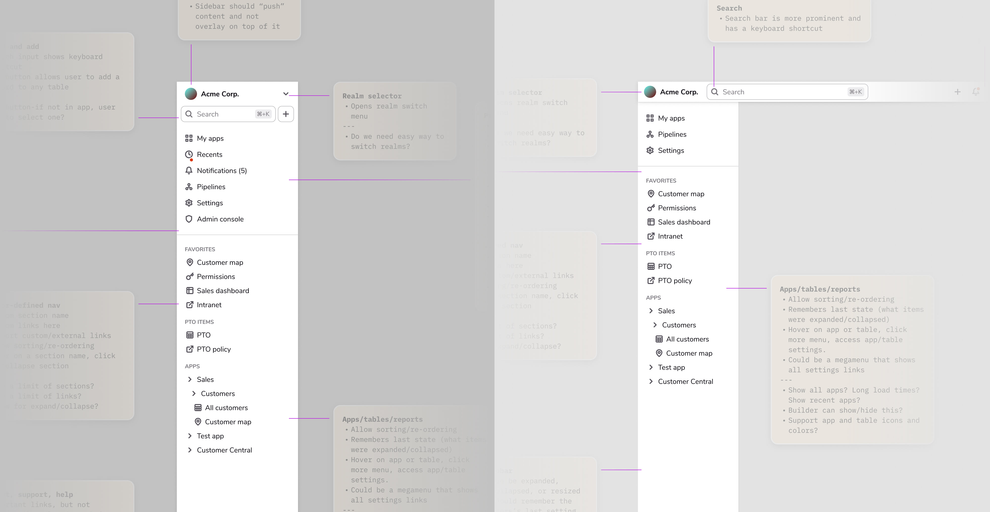
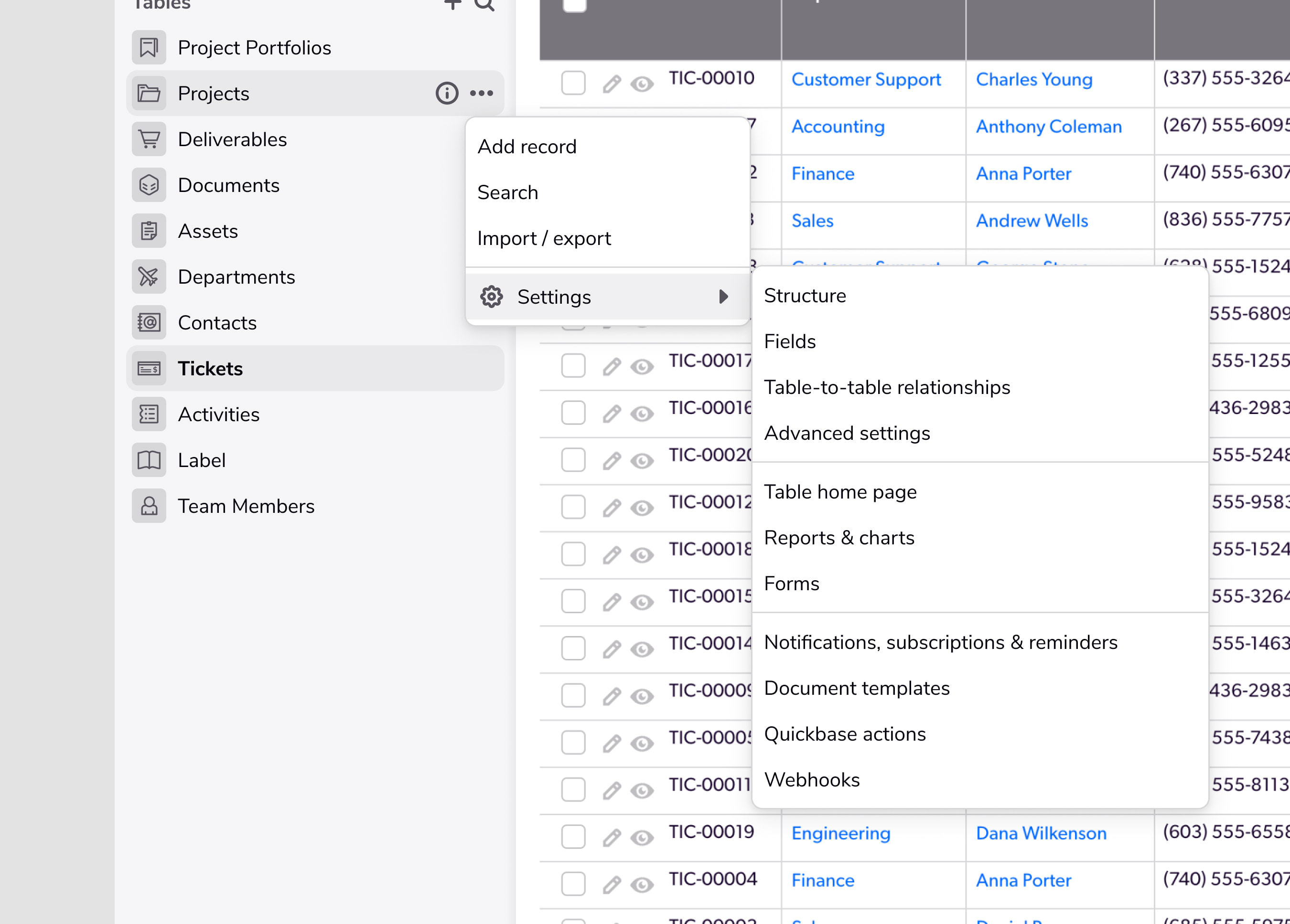
The initial concepts revolved around 2 main concepts:
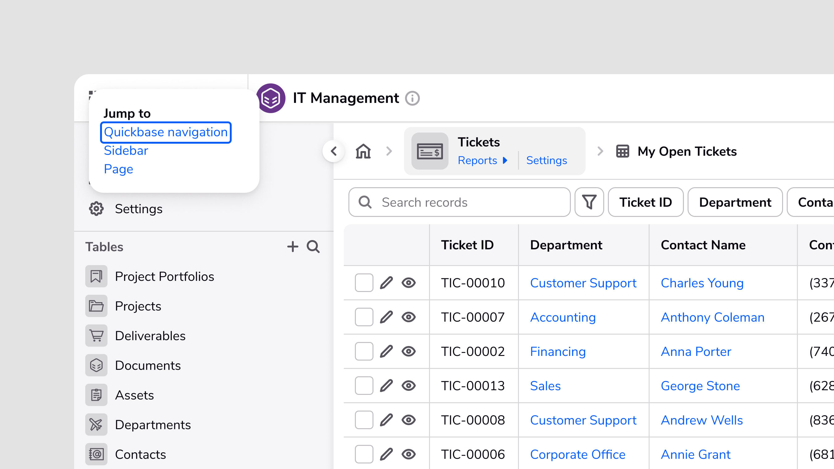
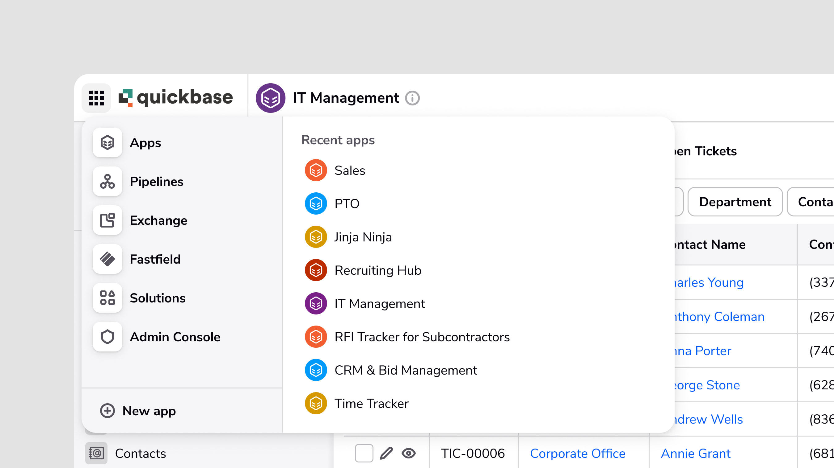
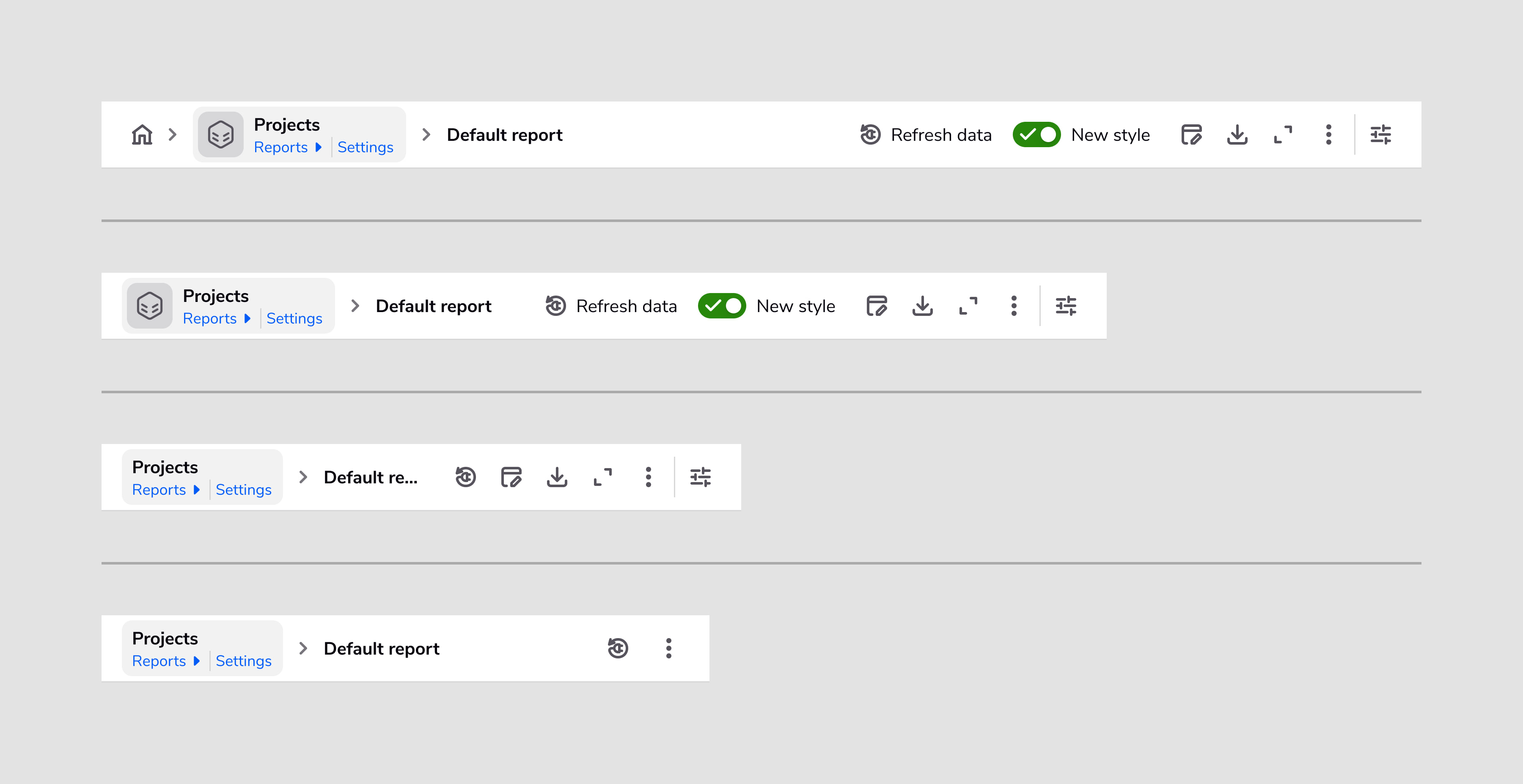
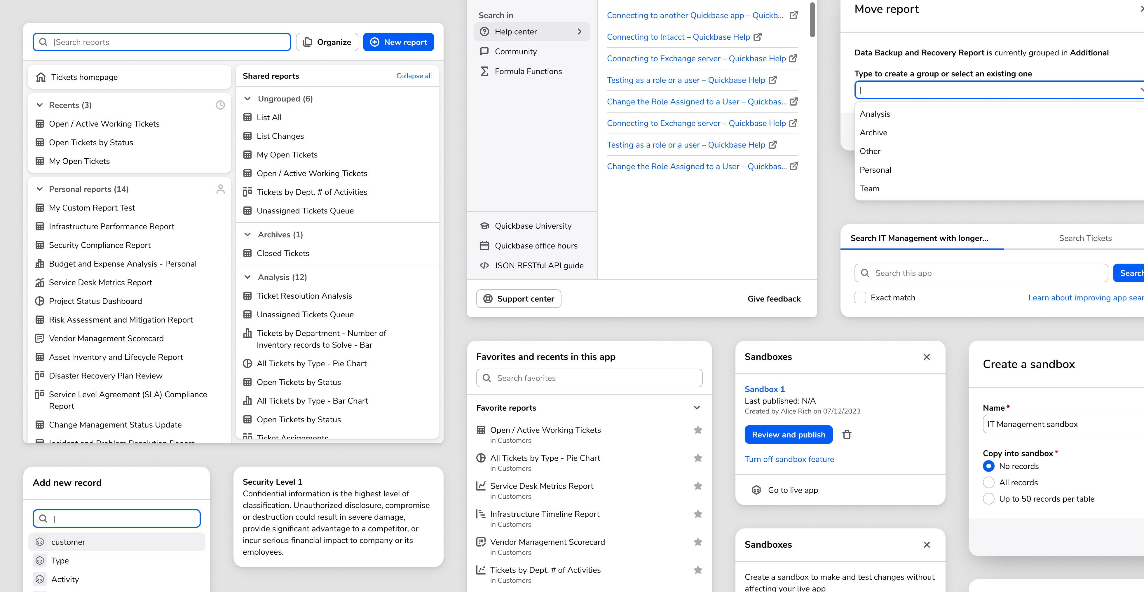
I also re-designed related features to be consistent with the top-level parts, such as the page bar, search, help menu, add record menu, and favorites menu.
One thing that I stressed to the team was that re-doing the navigation is a big change, and the look and feel of our current design system wouldn't let us put our best foot forward in that front. And there were things with data-density that could be improved from the current components. This would help drive forward our design system update.
Clean, sleek, modern, user-friendly, cool, familiar, consolidated, functional
I created several iterations of prototypes used for testing to get feedback, buy-in, and make sure the designs were feasible. Based on feedback from customers, non-customers, and internal stakeholders, we converged onto one design concept. These prototypes tested different navigation flows, related menus and dialogs, visuals, and content. From there, we converged onto the MVP that would be built.
Once the new navigation was built and launched in a closed beta, I ran some of the first impression and 1 month follow-up interviews. Our team also conducted accessibility testing, which I organized into our research database and synthesized.
Learnings and actions from our accessibility testing included:
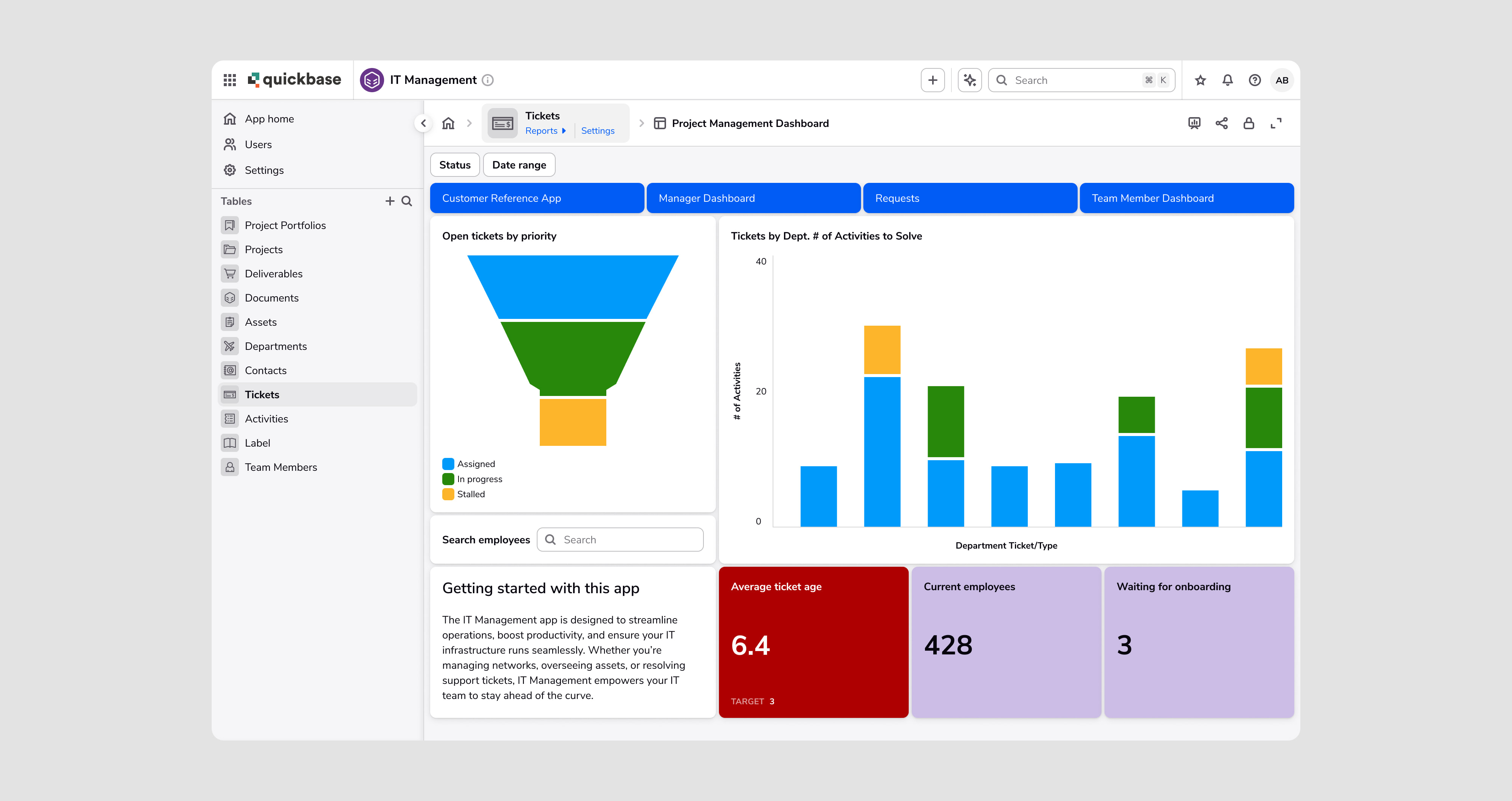
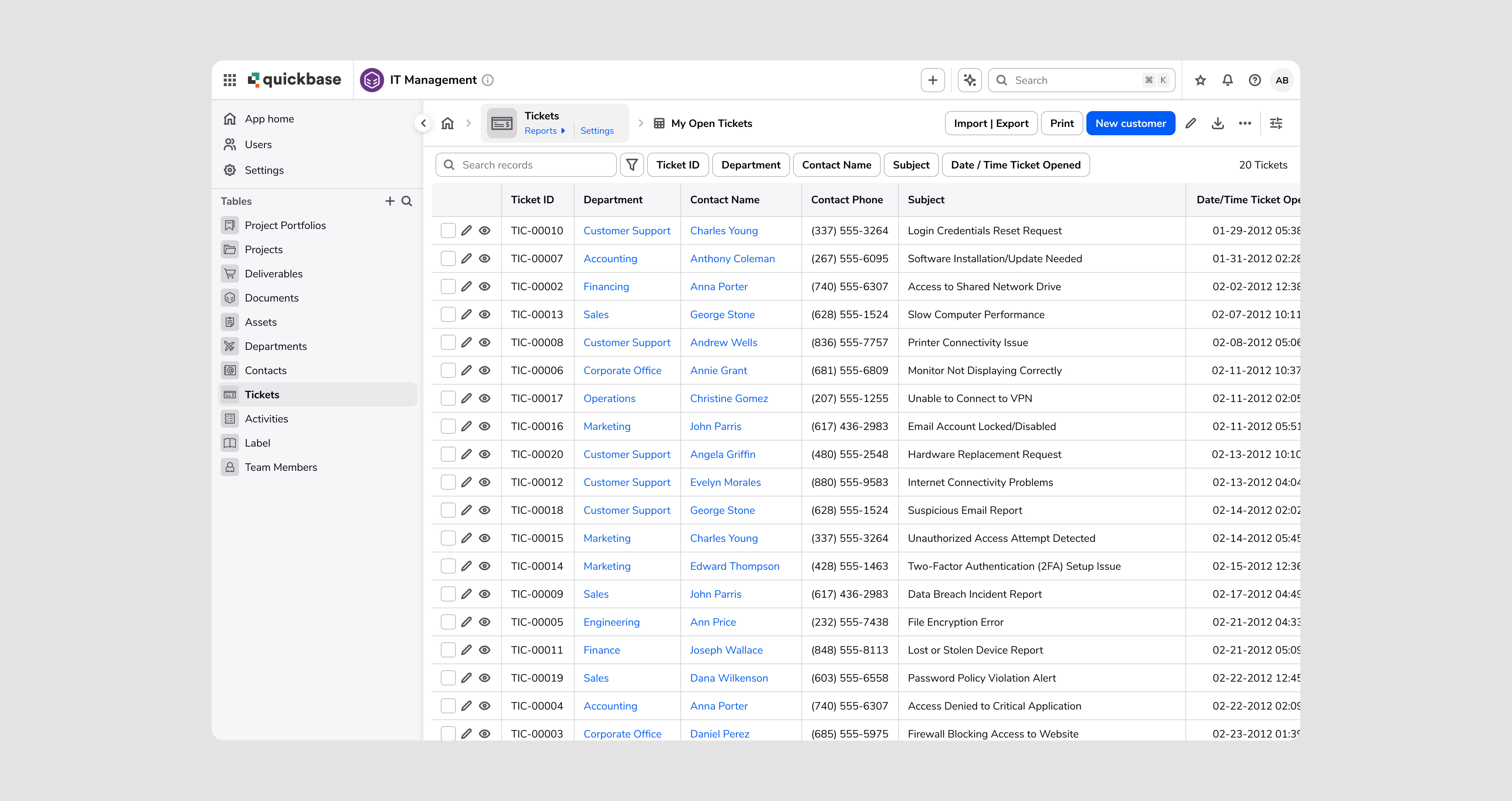
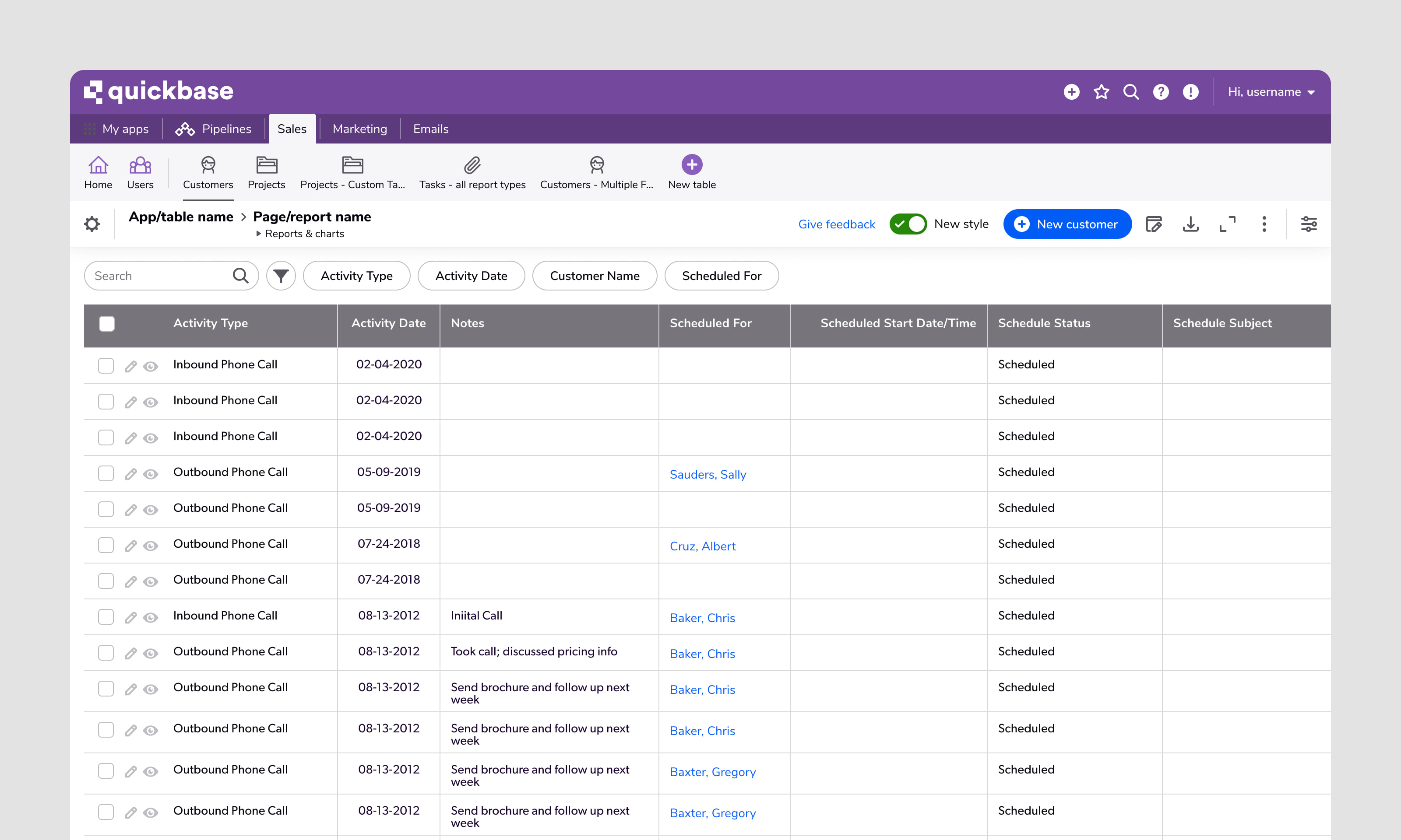
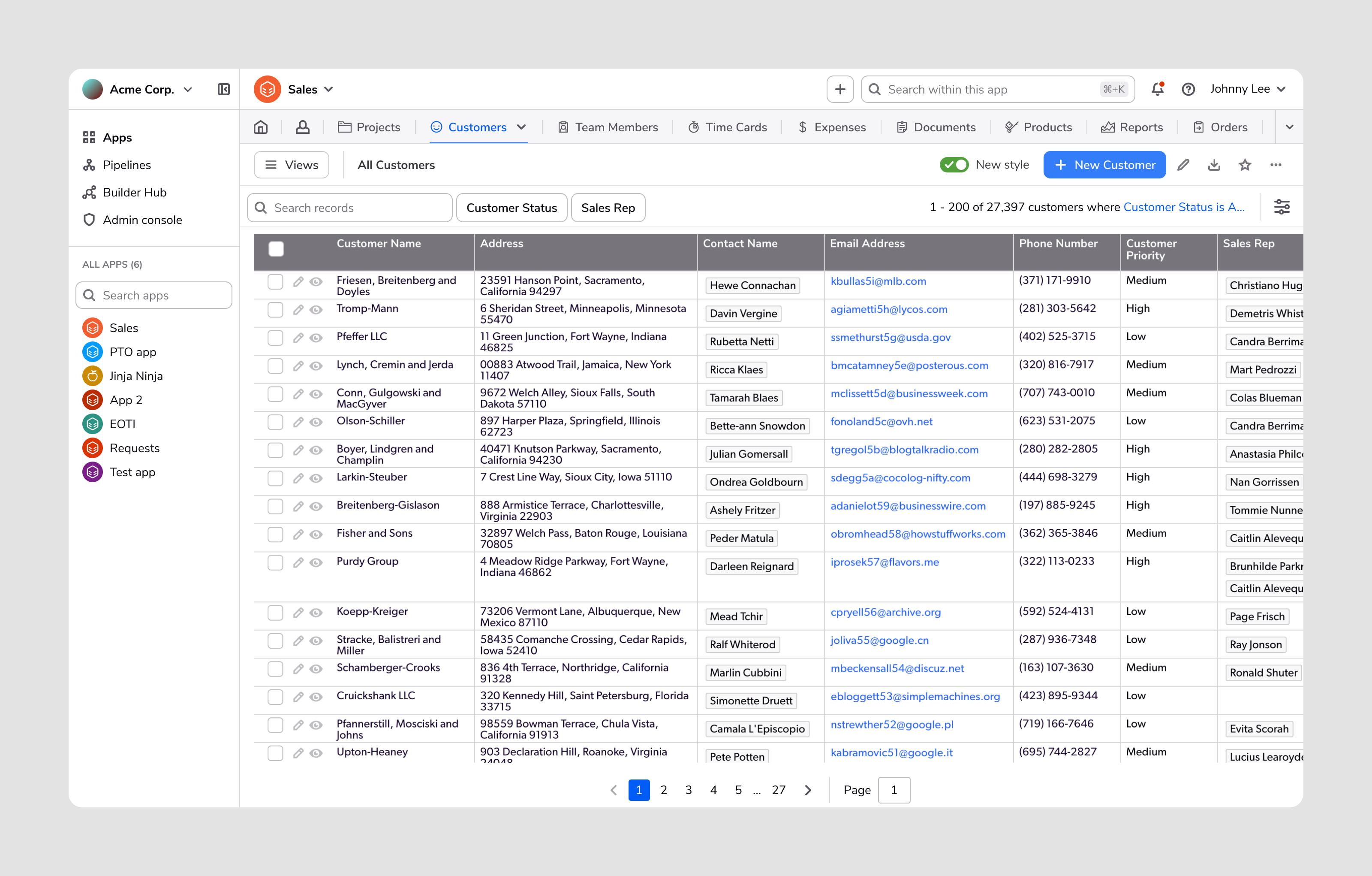
The shipped navigation featured a global bar at the top that houses top-level items, user settings, and help. A collapsible and resizable sidebar on the left allows users to navigate their apps and tables when they need to or hide it otherwise. Going this route streamlined the interface for new users while maintaining feature parity and functionality for more advanced users and admins. In addition, it addressed a longstanding complaint from users about the legacy navigation taking up too much screen real estate.
Two other notable enhancements include improved accessibility (via improved screen reader labels, aria landmarks, and keyboard navigation behavior) and implementing a consistent navigation experience across all platform features, some of which had their own navigation bars.
83%
Percentage of users sticking with new navigation
85%
Percentage of traffic using the new navigation
I've had the sidebar turned on as long as I've been able to. It's so much more modern-looking and gives so much more real estate. I love it.
Customer comment
In general, the new navigation has stuck with customers, especially in comparison with past features that we've launched. Positive customer feedback has revolved around better feature discoverability, improved use of screen real estate, feature parity with the legacy navigation, and enjoying the modern look.
The negative feedback that we received was expected, the volume was in our expected range, and decreased over time. The suggested improvements were generally things that we had already took steps to address in the future.
The navigation project also drove improvements internally. Within our design team, we updated how we audit, document, and work with engineers on communicating accessibility specifications and organize our files. Within the company, this project showed the value of a clear vision, communication, and the importance of taking the time to deliver a polished feature, even at the initial release.
●
After our general availability launch, I synthesized the initial round of customer feedback. From here, the team will plan and prioritize updates and new features that weren't built into the MVP.